Introduction
The Accessibility Observatory at the University of Minnesota is one of, if not the, leading center for the research and application of accessibility-based transportation system evaluation. They have harnessed the growth of big data in transportation, along with cloud computing resources, to conduct multiple groundbreaking accessibility studies that are unprecedented in scope. As part of a larger analysis utilizing their published data, this brief note combines the results of their 2015 auto and transit access to jobs studies (1, 2, 3) to examine the differences in access to jobs between transit and auto modes across the United States. This is a very modest application of the data sets developed through the extensive work conducted by Andrew Owen and Brendan Murphy at the Accessibility Observatory and David Levinson now at the University of Sydney. Any errors in this white paper are the responsibility of the author, however all of the credit for the extensive and indeed, ground-breaking, original accessibility analysis must go to those at the Accessibility Observatory.
Accessibility, also sometimes referred to as access to destinations, is easily understood in general terms, but it is difficult to precisely define and measure it. (4) One definition is “the ease of reaching goods, services, activities and destinations, which together are called opportunities.” (5) As shown in Figure 1, four factors affect accessibility: mobility, mobility substitutes (e.g., telecommuting), transportation system connectivity (the directness and degree of connectivity of the components of the transportation system) and proximity (which is a function of land use), since physical proximity typically increases accessibility. (6)
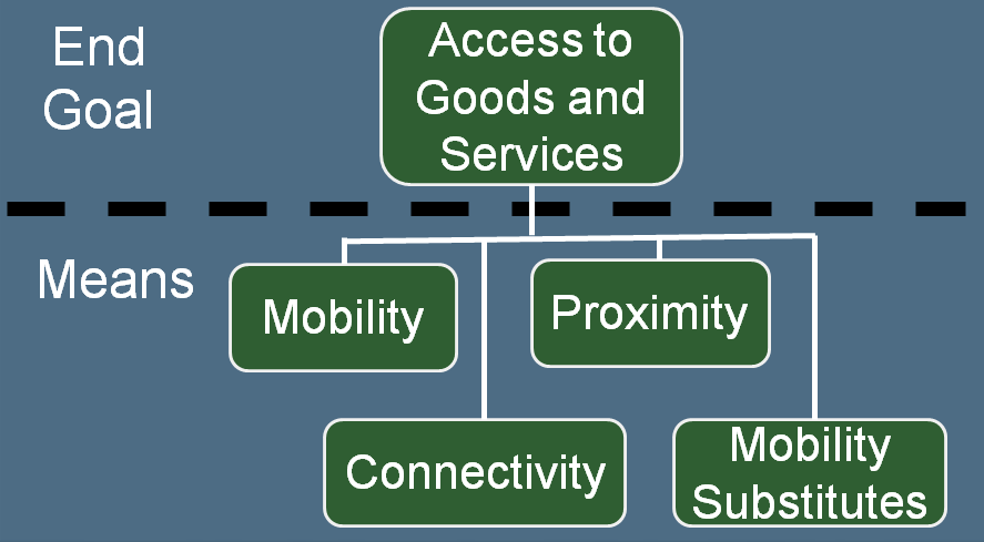
Figure 1 – Major Factors Affecting Access
Accessibility is a powerful concept for use in transportation planning, as it does not depend on the mechanisms used to achieve it. This allows alternative approaches to be considered on an equal footing with one another. For example, improved access to jobs may be provided by reducing congestion, growing the transit network, locating housing closer to work opportunities, or increasing the opportunities for telecommuting. As such, accessibility metrics provide a valuable complement to mobility and congestion metrics, such as average travel speed or delay. Pratt and Lomax state that “By using door-to-door travel time as the time measure, accessibility via alternative modes can be put on an essentially equal footing, as long as it is recognized that acceptability varies by mode. It is apparently as close to an ideal measure for multimodal performance analysis as can be achieved from the user perspective.” (7)
Accessibility Metrics
There are many ways to measure accessibility. Handy and Neimeier (8) provide a review of accessibility metrics in the planning field and El-Geneidy and Levinson (9) provide a comprehensive review. The model used in the Accessibility Observatory’s studies (1, 2, 3) is called the cumulative opportunity model.
Cumulative Opportunity:
Ci = ∑ Oj Bj
Ci Opportunities (jobs in these studies) reachable from zone i
Oj Opportunities (jobs) at zone j
Bj A binary value equal to 1 if zone j is reachable within a predetermined time from zone I, otherwise equal to 0
This measures the number of jobs available to the residents of a given small zone (census block in the Accessibility Observatory studies) within a given upper bound on door to door travel time. It has the advantages of being both simple to calculate and easy to understand. The units are number of jobs. However, the function uses a step function: all jobs within the travel time limit are counted equally, regardless of how quickly they can be reached, and jobs just one minute beyond the travel time limit are not counted at all. To address this limitation, the Accessibility Observatory studies looked at time thresholds of 10, 20, 30, 40, 50, and 60 minutes. For each time threshold, they then computed worker-weighted average number of jobs across the city as a whole (e.g., if one zone had 50 workers, another had 100, and a third had 200, then the second zone would have twice the weight of the first zone, and the third zone would have four times the weight of the first zone).
Once a worker-weighted average was computing for entire region for each time slice, a weighted sum of the time slices was computed to obtain an accessibility score for each region. The weighted sum was calculated as: (3)

The Modal Accessibility Gap (MAG), introduced by Kwok and Yeh (10) is a measure of the difference in accessibility between transit and personal automobiles. The formula for computing the MAG is:

Ap Transit Accessibility
Ac Automotive Accessibility
The values for the MAG range between -1 and +1. At zero the two modes provide equal accessibility, a value of 1 would mean that there was no access via private automobiles, while a value of -1 would mean there was zero access via transit.
Comparison of Transit vs. Auto Access to Jobs for Forty-Nine Regions across America
The Accessibility Observatory conducted auto access to jobs analyses for 50 of the largest (by population) metropolitan areas in the US, and conducted transit access to jobs analyses for 49 of them (Memphis, TN could not be included due to the lack of available GTFS-formatted transit schedules for Memphis). As described above, they computed a weighted access score combining the results from multiple isochrones, and the rank order varies depending upon which individual isochrone one examines. Using those scores, Figure 2 plots the MAG for each of the 49 cities, beginning with New York, New York which has the highest MAG score of -0.84, and ending with Riverside, California, which has the lowest score of -0.98. While it is not at all surprising that New York City’s score is significantly better than any other city, and San Francisco is significantly better than all cities except New York, it is important to note how low even New York City’s score is. On this scale, 0 would be equal access and -1.0 represents no transit service. Even New York City scores below -0.8. The ten cities with the best MAG scores are:
- New York
- San Francisco
- Boston
- Washington
- Chicago
- Seattle
- Philadelphia
- Portland
- Pittsburgh
- Milwaukee
While the weighted scores and the resulting MAG scores provide a more complete and likely more accurate representation, it is hard to have an intuitive feel for what the scores mean. If one picks a particular isochrones, say, for example, jobs reachable within 60 minutes, one can also simply compute the ratio of jobs reachable by transit versus jobs reachable by auto. Figure 3 shows these ratios for both 30 minute and 60 minute isochrones. The order of the cities is the same MAG score ordering used in Figure 2. Figure 3 clearly illustrates how the results vary by the selection of the isochrone one uses for this approach. In particular, while the 30 minute order is approximately the same as that for the MAG scores that use the combined weighted scores, the 60 minute isochrones ratios show dramatically different results.
In order to further investigate the occasionally striking differences in the rankings between the overall MAG score, the 30 minute isochrones, and the 60 minute isochrones, we can take a somewhat deeper dive into Salt Lake City and Las Vegas. These cities would rank 2nd and 5th in comparative transit accessibility if one looks only at the 60 minute isochrones ratios, whereas they rank 14th and 37th using the MAG scores and 14th and 42nd using the 30 minute isochrone ratios. When one looks at the ratio between jobs accessible by auto within 30 minutes vs. 60 minutes, the average across all 49 cities is 51%. However that ratio is highest (97%) for Las Vegas, and 4th highest (68%) for Salt Lake City. Similarly, when comparing the ration of jobs accessible by transit, one finds that Las Vegas has the largest percentage increase in jobs reachable by transit within 60 versus 30 minute, and Salt Lake City has the 6th largest increase. What is happening in these two cities is that as you go further out from the city center, the number of jobs drops off far more rapidly than it does for the average metropolitan region. Therefore increasing the auto catchment area from a 30 minute to a 60 minute isochrone adds far fewer additional new jobs than in the average city. On the other hand, many of the jobs reachable within 30 minutes by auto but not by transit are reachable by a 60 minute or less transit trip. Therefore the modal access gap decreases significantly for the larger 60 minute catchment areas. In addition to providing a satisfactory explanation for these discrepancies, this is an example of the types of “deeper dives” one can take using the data provided by the Accessibility Observatory.
Conclusions
Even in New York, the most transit-friendly city in terms of transit vs. auto access, a 30 minute transit ride provides access to less than 8% as many jobs as are accessible by auto. The situation is somewhat better when one compares 60 minute trips, as the ratio increases to almost 19%. Even so, access to an automobile provides the average New Yorker with the ability to reach far more potential jobs than does transit. In many of the largest U.S. cities, transit provides the average resident with access to less than 5% of the potential jobs that an auto provides access to. Clearly there are opportunities to expand the utility of the transit systems in the U.S. This involves a combination of increased service, better alignment of service with needs, and with land-use changes to increase access. Doing so will reduce the modal access gap, which is a desirable goal. At the same time, the accessibility gap is so large that it is unrealistic to expect the modal gap to shrink to zero in any U.S. city. Transit can be more competitive, but is not an adequate total replacement for auto access for most urban residents. The only way parity could be achieved would be by putting extremely large regulatory restrictions on auto use, which would like have large negative effects on the regional economy.
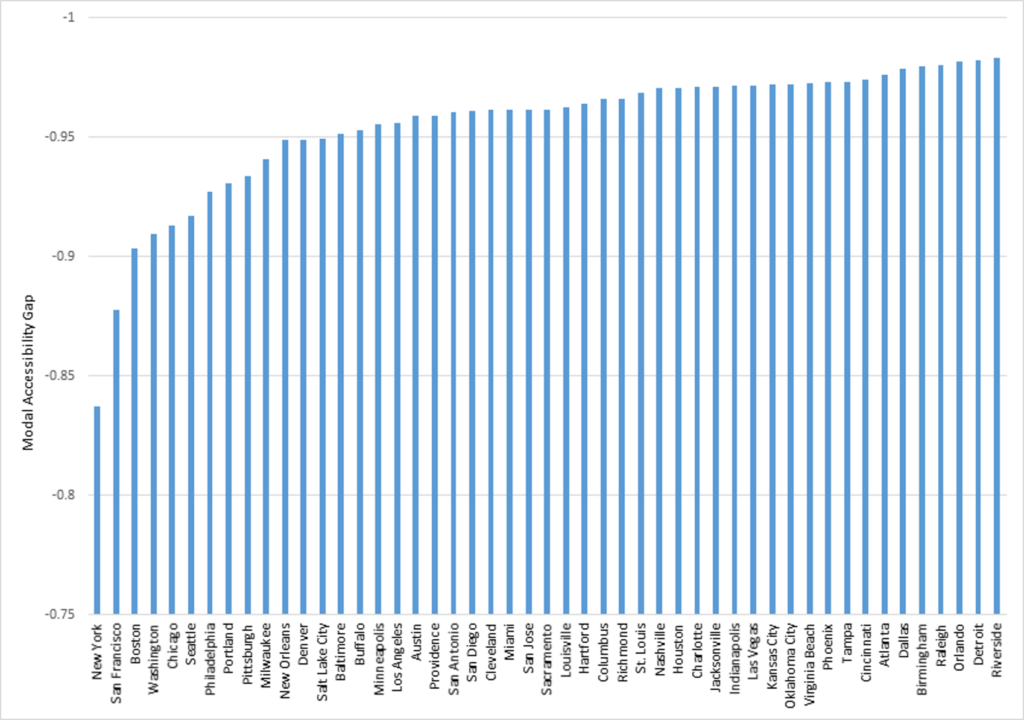
Figure 2 – Modal Accessibility Gap for 49 Urban Areas
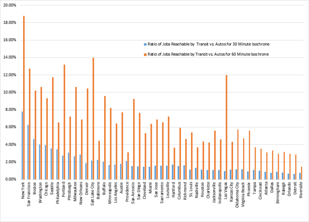
Figure 3 – Ratios of Jobs Reachable by Transit vs. Auto for 30 and 60 Minute Isochrones
References
- Owen, A., Murphy, B., and Levinson, D., Access Across America: Auto 2015, CTS 16-07, Accessibility Observatory, University of Minnesota, http://www.cts.umn.edu/Publications/ResearchReports/pdfdownload.pl?id=2724, September 2016.
- Owen, A., Murphy, B., and Levinson, D., Access Across America: Transit 2015, CTS 16-09, Accessibility Observatory, University of Minnesota, www.cts.umn.edu/Publications/ResearchReports/pdfdownload.pl?id=2740, December 2016.
- Owen, A., Murphy, B., and Levinson, D., Access Across America: Transit 2015 Methodology, CTS 16-10, Accessibility Observatory, University of Minnesota, www.cts.umn.edu/Publications/ResearchReports/pdfdownload.pl?id=2738, December 2016.
- Handy, S. Accessibility- vs. Mobility-Enhancing Strategies for Addressing Automobile Dependence in the U.S., Prepared for the European Conference of Ministers of Transport, www.des.ucdavis.edu/faculty/handy/ECMT_report.pdf, 2002. Accessed 31 January 2017.
- Litman, T. Evaluating Accessibility for Transportation Planning, Victoria Transport Policy Institute, 2010.
- Litman, T. Accessibility: Evaluating People’s To Reach Desired Goods, Services and Activities, from The Online TDM Encyclopedia, http://www.vtpi.org/tdm/tdm84.htm, Victoria Transport Policy Institute, accessed 31 January 2017.
- Pratt, R.H. and T. J. Lomax. Performance Measures for Multimodal Transportation Systems, in Transportation Research Record 1518, TRB, National Research Council, Washington, D.C. 1996.
- Handy, S.L. and D.A. Neimeier, Measuring Accessibility: An Exploration of Issues and Alternatives in Environment and Planning A, 29(7), 1997.
- El-Geneidy, A.M. and D.M. Levinson, Access to Destinations: Development of Accessibility Measures, Report Number MN/RC-2006-16. Minnesota Department of Transportation, St. Paul, Minnesota, 2006.
- Kwok R.C.W. and A.G.O. Yeh. The Use of Modal Accessibility Gap as an Indicator for Sustainable Transport Development in Environment and Planning A 36(5) 921 – 936, 2004.
Appendix: Data Used to Produce the Graphs
Note: The 30 and 60 minute transit and auto jobs numbers are taken from (1, 2). The Auto and transit “scores” were calculated using the formula documented by the same researchers in [3]. The other columns are simple arithmetic calculations on the data.
| Area | Auto Score | Transit Score | MAG | 30 Minute Transit Jobs | 60 Minute Transit Jobs | 30 Minute Auto Jobs | 60 Minute Auto Jobs | Ratio of Jobs Reachable by Transit vs. Autos for 30 Minute Isochrone | Ratio of Jobs Reachable by Transit vs. Autos for 60 Minute Isochrone |
| New York | 525315.72 | 46588.27 | -0.83708 | 204,745 | 1,221,944 | 2,630,585 | 6,506,319 | 7.78% | 18.78% |
| San Francisco | 238794.60 | 15596.46 | -0.87738 | 71,107 | 374,615 | 1,134,881 | 2,946,891 | 6.27% | 12.71% |
| Boston | 203507.60 | 10321.82 | -0.90346 | 43,778 | 271,810 | 938,582 | 2,661,083 | 4.66% | 10.21% |
| Washington | 237959.35 | 11263.46 | -0.90961 | 46,416 | 328,133 | 1,157,426 | 3,087,743 | 4.01% | 10.63% |
| Chicago | 263921.22 | 12043.20 | -0.91272 | 50,586 | 328,034 | 1,277,622 | 3,510,329 | 3.96% | 9.34% |
| Seattle | 152052.65 | 6568.96 | -0.91717 | 26,591 | 178,983 | 744,695 | 1,523,327 | 3.57% | 11.75% |
| Philadelphia | 202822.39 | 7653.31 | -0.92728 | 34,234 | 193,921 | 992,362 | 2,960,701 | 3.45% | 6.55% |
| Portland | 135121.27 | 4848.44 | -0.93072 | 18,790 | 145,855 | 687,220 | 1,105,569 | 2.73% | 13.19% |
| Pittsburgh | 87152.38 | 2997.65 | -0.93350 | 13,101 | 77,906 | 425,627 | 1,076,698 | 3.08% | 7.24% |
| Milwaukee | 140785.83 | 4304.40 | -0.94067 | 17,009 | 126,147 | 636,663 | 1,188,778 | 2.67% | 10.61% |
| New Orleans | 76958.06 | 2020.84 | -0.94883 | 9,114 | 43,513 | 317,668 | 630,749 | 2.87% | 6.90% |
| Denver | 189450.32 | 4969.26 | -0.94888 | 18,668 | 159,153 | 992,037 | 1,525,933 | 1.88% | 10.43% |
| Salt Lake City | 150735.78 | 3923.23 | -0.94927 | 13,970 | 134,513 | 645,816 | 963,767 | 2.16% | 13.96% |
| Baltimore | 168365.04 | 4177.73 | -0.95157 | 17,669 | 113,063 | 795,212 | 2,549,800 | 2.22% | 4.43% |
| Buffalo | 91489.79 | 2207.99 | -0.95287 | 8,863 | 57,688 | 431,900 | 602,500 | 2.05% | 9.57% |
| Minneapolis | 196260.45 | 4472.47 | -0.95544 | 17,043 | 139,841 | 1,023,854 | 1,700,783 | 1.66% | 8.22% |
| Los Angeles | 471467.08 | 10690.02 | -0.95566 | 39,564 | 358,984 | 2,323,105 | 5,577,313 | 1.70% | 6.44% |
| Austin | 126962.60 | 2664.14 | -0.95890 | 10,808 | 76,039 | 600,751 | 988,117 | 1.80% | 7.70% |
| Providence | 95155.48 | 1991.60 | -0.95900 | 8,615 | 48,280 | 410,653 | 1,553,681 | 2.10% | 3.11% |
| San Antonio | 127709.79 | 2566.90 | -0.96059 | 9,533 | 84,016 | 614,300 | 907,807 | 1.55% | 9.25% |
| San Diego | 167990.34 | 3341.37 | -0.96100 | 11,999 | 107,182 | 809,037 | 1,408,331 | 1.48% | 7.61% |
| Cleveland | 119803.72 | 2369.88 | -0.96120 | 8,660 | 74,609 | 602,907 | 1,405,385 | 1.44% | 5.31% |
| Miami | 198441.91 | 3913.26 | -0.96132 | 14,462 | 122,624 | 991,891 | 1,914,507 | 1.46% | 6.40% |
| San Jose | 255195.80 | 5030.06 | -0.96134 | 16,739 | 184,272 | 1,060,964 | 2,673,982 | 1.58% | 6.89% |
| Sacramento | 124995.74 | 2459.49 | -0.96141 | 9,483 | 71,009 | 606,135 | 1,084,079 | 1.56% | 6.55% |
| Louisville | 93005.27 | 1773.99 | -0.96257 | 6,932 | 51,278 | 443,985 | 711,930 | 1.56% | 7.20% |
| Hartford | 123350.80 | 2253.02 | -0.96412 | 10,091 | 55,364 | 588,640 | 1,520,727 | 1.71% | 3.64% |
| Columbus | 135363.36 | 2344.24 | -0.96595 | 9,812 | 64,154 | 647,442 | 1,078,674 | 1.52% | 5.95% |
| Richmond | 85741.44 | 1482.40 | -0.96601 | 6,679 | 32,582 | 413,263 | 702,615 | 1.62% | 4.64% |
| St. Louis | 125519.60 | 1997.38 | -0.96867 | 7,284 | 63,333 | 653,446 | 1,176,161 | 1.11% | 5.38% |
| Nashville | 79409.20 | 1195.99 | -0.97032 | 5,027 | 30,689 | 379,632 | 828,851 | 1.32% | 3.70% |
| Houston | 225082.08 | 3348.40 | -0.97068 | 12,666 | 106,955 | 1,150,184 | 2,453,742 | 1.10% | 4.36% |
| Charlotte | 109424.02 | 1605.89 | -0.97107 | 6,179 | 46,654 | 562,123 | 1,107,895 | 1.10% | 4.21% |
| Jacksonville | 80282.59 | 1176.85 | -0.97111 | 4,299 | 35,635 | 394,317 | 638,272 | 1.09% | 5.58% |
| Indianapolis | 119733.76 | 1739.03 | -0.97137 | 6,790 | 50,708 | 619,249 | 1,101,798 | 1.10% | 4.60% |
| Las Vegas | 167927.09 | 2409.65 | -0.97171 | 7,469 | 94,883 | 768,405 | 791,240 | 0.97% | 11.99% |
| Kansas City | 114950.64 | 1641.18 | -0.97185 | 6,851 | 42,695 | 608,689 | 990,808 | 1.13% | 4.31% |
| Oklahoma City | 86678.07 | 1225.74 | -0.97211 | 4,794 | 34,679 | 413,861 | 606,913 | 1.16% | 5.71% |
| Virginia Beach | 80830.81 | 1126.80 | -0.97250 | 4,433 | 31,913 | 381,616 | 672,709 | 1.16% | 4.74% |
| Phoenix | 192031.10 | 2632.14 | -0.97296 | 9,019 | 94,360 | 1,006,102 | 1,687,626 | 0.90% | 5.59% |
| Tampa | 126527.73 | 1731.31 | -0.97300 | 6,673 | 51,745 | 623,831 | 1,403,980 | 1.07% | 3.69% |
| Cincinnati | 112935.37 | 1482.95 | -0.97408 | 5,809 | 42,573 | 589,391 | 1,203,539 | 0.99% | 3.54% |
| Atlanta | 158820.51 | 1925.32 | -0.97605 | 6,869 | 63,956 | 804,812 | 2,046,662 | 0.85% | 3.12% |
| Dallas | 258742.21 | 2797.28 | -0.97861 | 9,825 | 95,130 | 1,346,253 | 2,878,685 | 0.73% | 3.30% |
| Birmingham | 62777.06 | 649.05 | -0.97953 | 2,553 | 17,365 | 298,483 | 591,188 | 0.86% | 2.94% |
| Raleigh | 115540.82 | 1161.83 | -0.98009 | 4,528 | 33,500 | 566,967 | 1,062,914 | 0.80% | 3.15% |
| Orlando | 137113.80 | 1284.50 | -0.98144 | 4,716 | 40,633 | 700,380 | 1,371,852 | 0.67% | 2.96% |
| Detroit | 190620.85 | 1707.06 | -0.98225 | 6,020 | 58,067 | 988,497 | 2,021,310 | 0.61% | 2.87% |
| Riverside | 130226.18 | 1120.87 | -0.98293 | 4,238 | 34,910 | 583,025 | 2,378,179 | 0.73% | 1.47% |